Matt Holben, Graphic Design MFA, 2022
Matt Holben is a printer, artist, and designer. His practice is driven by a desire to communicate with himself and others using language and a variety of mediums. He utilizes the constraints of older technology and found imagery as a means to encourage creative expression and connection in his work.
Project Overview
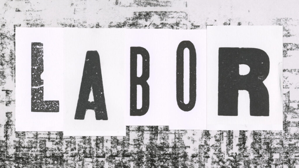
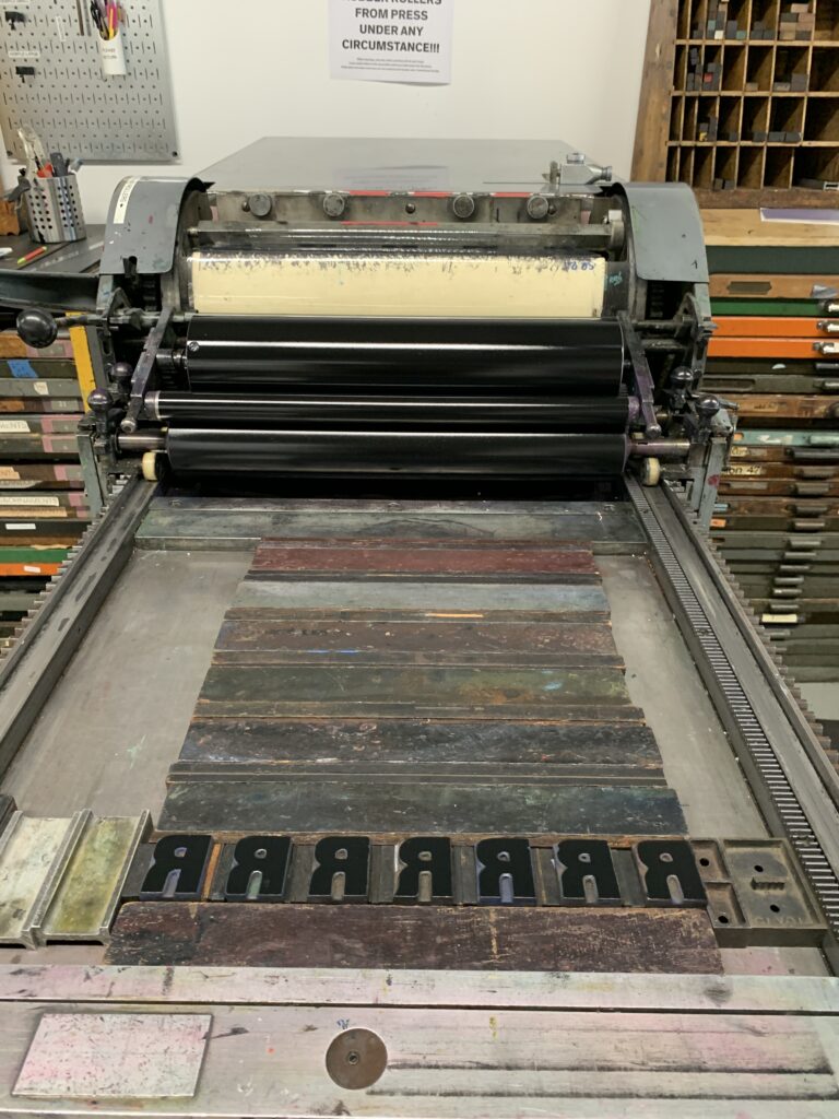
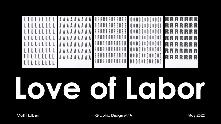
Is the human body a machine? In Love of Labor, Matt Holben probes the limits of machines designed to repeat a task an infinite number of times. Here, the machine of the body works in conjunction with a decades-old Vandercook SP-20 proof press to push the boundaries of what both are capable of. The historic wood type that is printed also contributes its heritage and history to each print, lending a distinctiveness to each instance of the letter. And so, amongst the repetition, a uniqueness emerges in each printed character, each subject to influences of human, machine, and environmental factors.
Process
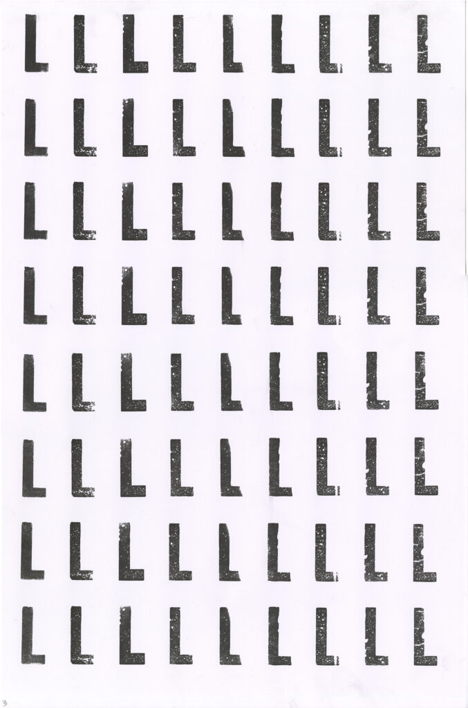
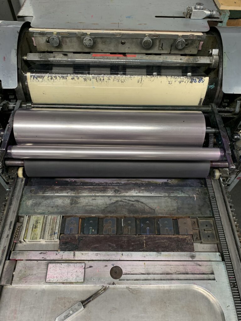
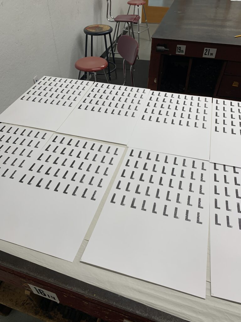
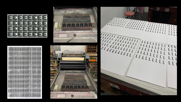
Love of Labor consists of hundreds of unique images of vintage wood type. Each frame of the video was physically printed on paper using a Vandercook SP-20 proofing press, only adding ink at the beginning of a session in an attempt to push the limits of material and machine. Restricted by the scarcity of the wood type, the letters were printed one row at a time, moving the line down the page as the printing progressed. After scanning each page, the pages were digitally cut and assembled into a 35 second video.
Presentation


- Hi everyone! My name is Matt Holben, and am currently a second year student in the Graphic Design MFA program at MICA. I am a printer, artist, and designer that has been “lovingly” referred to as “intentionally archaic.” My work explores how new and old techniques and technologies might work together to create more communicative and empathetic work.
- Love of Labor explores the limits of machines designed to repeat the same task an infinite number of times. What happens when the machine of the body works in conjunction with a decades-old Vandercook SP-20 proof press, that was purpose built for repetitive work?
- The limits of the materials meant I only had enough letters for one line, and so the process went something like this: lock up that line, print that on 10 – 14 sheets. Then, I would manually move the line down by one row, print that, and so on and so forth. I only added ink at the beginning of a printing session – I was hoping to see a noticeable change in ink coverage as the printing progressed, to push the limits of how long the printing session could go.
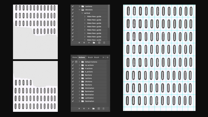
- I needed, though, was a way to easily and quickly cut out letters on a page, in a relatively uniform fashion. After all, there were a minimum of 40 characters per page, and doing them all one by one would be really tedious. After exploring some other options, including AI based programs and open source software, I eventually reverted back to Photoshop.
I had to change the way I printed the sheets in order to make it possible. By allowing for more space between each letter and each line, Photoshop was better able to semi-automatically cut out the characters without cutting THE characters.
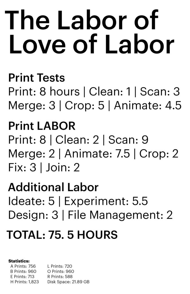
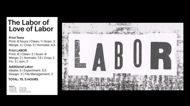
Using automatic actions such as photomerge allowed me to more quickly stitch together the two halves of the scanned sheets. Then I was able to record actions to both cut the letters out as well as to make them into a short video. With some some rudimentary video editing skills I could take each short video of each poster and stitch them into the longer final video. - Here is the resulting video, along with the statistics of the labor that went into it. As you can see, about 75 hours worth of work went into this relatively simple looking, 35 second long video. I will reiterate that each frame/flash of a letter you see here is a unique, printed, scanned, and animated specimen.
- I learned that technology can be a useful tool, even in analog process, but that it changes the process in different ways than I have previously experienced. Throughout the process, I was constantly making decisions about aspects of the work, a series of push and pull. For instance, how to be most efficient with the printing in order to make the digital processing faster. There were so many factors to consider with each decision, even paper size.
Even though these machines were built to perform the same tasks over and over, and muscle memory helps the human machine to do the same, there still remains uniqueness and variation in each printed letter. I don’t think any two of these characters is identical, despite being printed by type made at the same mill at the same time and being printed on the same paper using the same press on the same day by the same person with the same type of ink.
Some history of its use and some part of me is embedded in these prints, and I think that’s pretty special. Amongst the repetition, a uniqueness emerges in each printed character, each subject to influences of human, machine, and environmental factors. Indeed, we need the repetition to recognize the uniqueness. - I’d like to thank Annet and Ryan, as well as Margaret and Alan and Vic, for their assistance, insights, and support on this project. Additionally, thanks to the Globe Collection and Press for all the beautiful wood type, and Allison Fisher especially for her understanding of the seeming insanity of this whole thing. Lastly, to Joe Benghauser, for introducing me to printing years ago and starting me on this path.
Learn More
Creative Process Journal
Portfolio
Instagram
Globe Collection and Press